Recruiters email CVs to hiring managers and then chase them for weeks. Every tool that fixes this asks the hiring manager to make an account, which is the one thing they will not do.booqd puts the whole decision behind one link in the email they already have. I designed it, built it, and it is live. It is invitation only, so every screen here is the running product rather than something you can open.
Role
Designer and engineer
Team
Me, with one recruiter as the client
Scope
Product, interface, UX writing, full stack
Market
UK agency recruitment
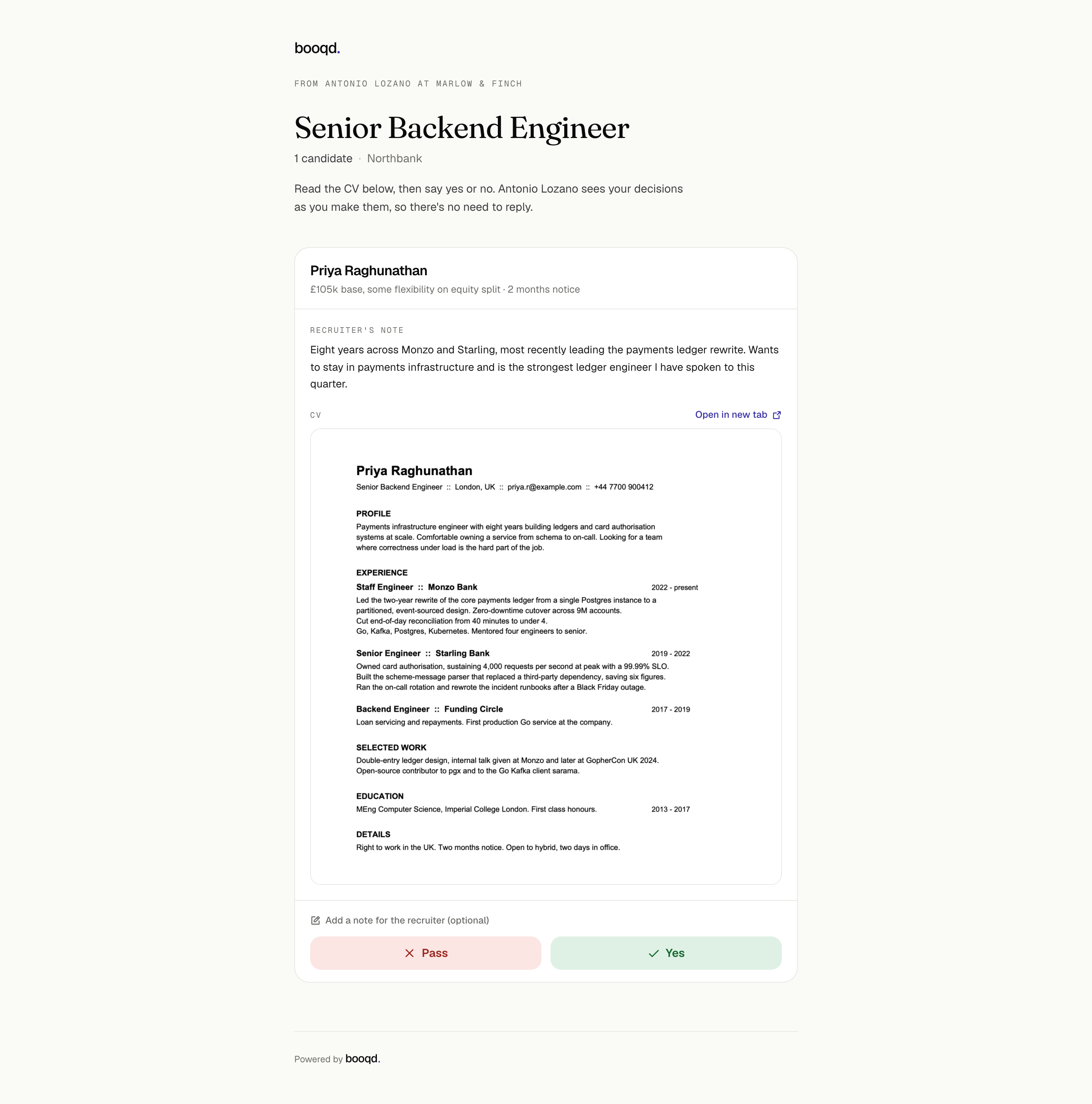
The whole product in one screen. No sign-in, no download, no reply. The CV is rendered in the page and the decision is two taps.
The problem
The product happens in somebody else’s inbox
A recruiter’s day is not spent in a dashboard. It is spent waiting on people who do not work for them. A hiring manager who has to open a CV. A panel that has to offer times. A candidate who has to pick one. None of those people will install anything, and none of them will sign up.
So the app is the small part. The product is mostly messages, landing somewhere the recruiter cannot see. That reframing set the two rules everything else follows: the client never authenticates, and nothing leaves without the recruiter having seen it first.
Every account you ask a client to make is a place the process can stop.
Written before any screen. It is also why the case below spends more time on emails and waiting than on the app.
The decisions
What we explored, and what we left behind
Two choices shaped everything after them. Both had a safer option, and both cost something real that I took on purpose.
ExploredAn account per contact
Make the client sign in
Real identity, revocable access, an audit trail that names a person.
Every reset password and every seat is a thing the recruiter now supports.
A signup wall in front of a favour nobody asked for is where this product dies.
ChosenA tokenised link
The email is the credential
One unguessable single-purpose link, straight from the email, decision in two taps.
Access is per link, so identity is only as strong as the inbox it landed in.
Tracking can say the client owes the next move, but not which person. I took that.
The same token pattern then had to carry three more surfaces: picking interview times, suggesting different ones, and giving feedback after the interview. Each is a separate single-purpose link, so a forwarded email never grants more than the thing it was for.
ExploredConfirm first
A dialog on Yes and Pass
Passing on a candidate is consequential and hard to walk back.
It doubles two taps into four and turns a quick favour into a form.
It taxes the ninety-nine correct decisions to protect the one mistake.
ChosenCommit, then undo
Act now, take it back for a while
The decision commits immediately and the recruiter sees it land.
The alternative stays recoverable, so the cost sits on the rare mistake.
Sending, which is genuinely irreversible, still asks. It just asks in place.
Flow one
The client decides
The hiring manager taps the link in their email and lands on the whole job: the recruiter’s note, the CV in the page rather than as a download, an optional private note, and two buttons. The page tells them the recruiter can already see the decision, so they do not also have to reply.
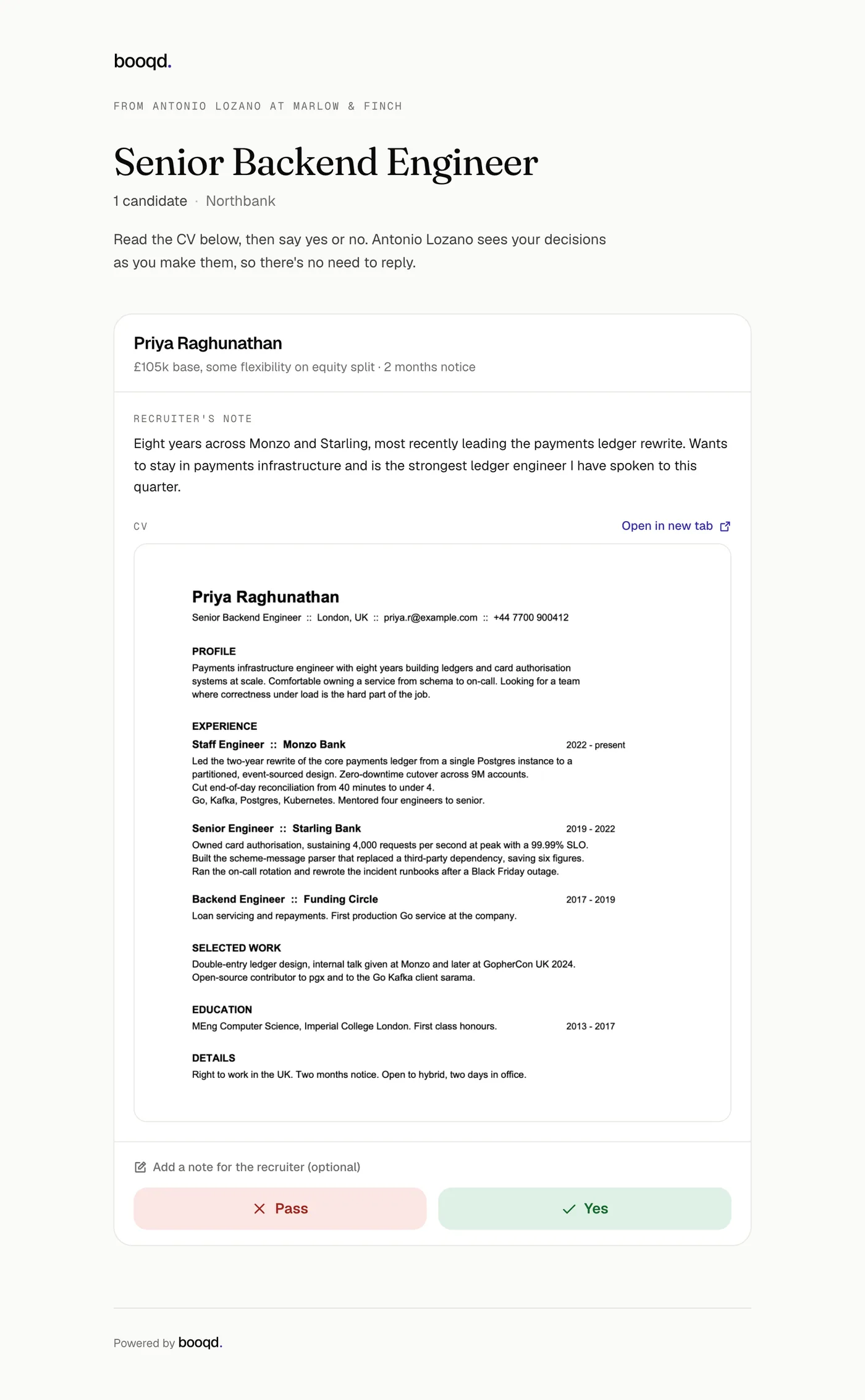
01Arrive. The CV opens where they are. On a phone, a PDF attachment is where this stalls for a day.
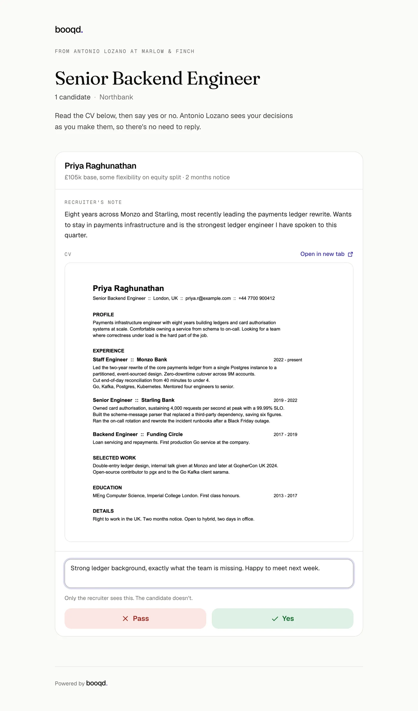
02The optional note, collapsed by default so it never reads as required. “Only the recruiter sees this.” settles the obvious worry.
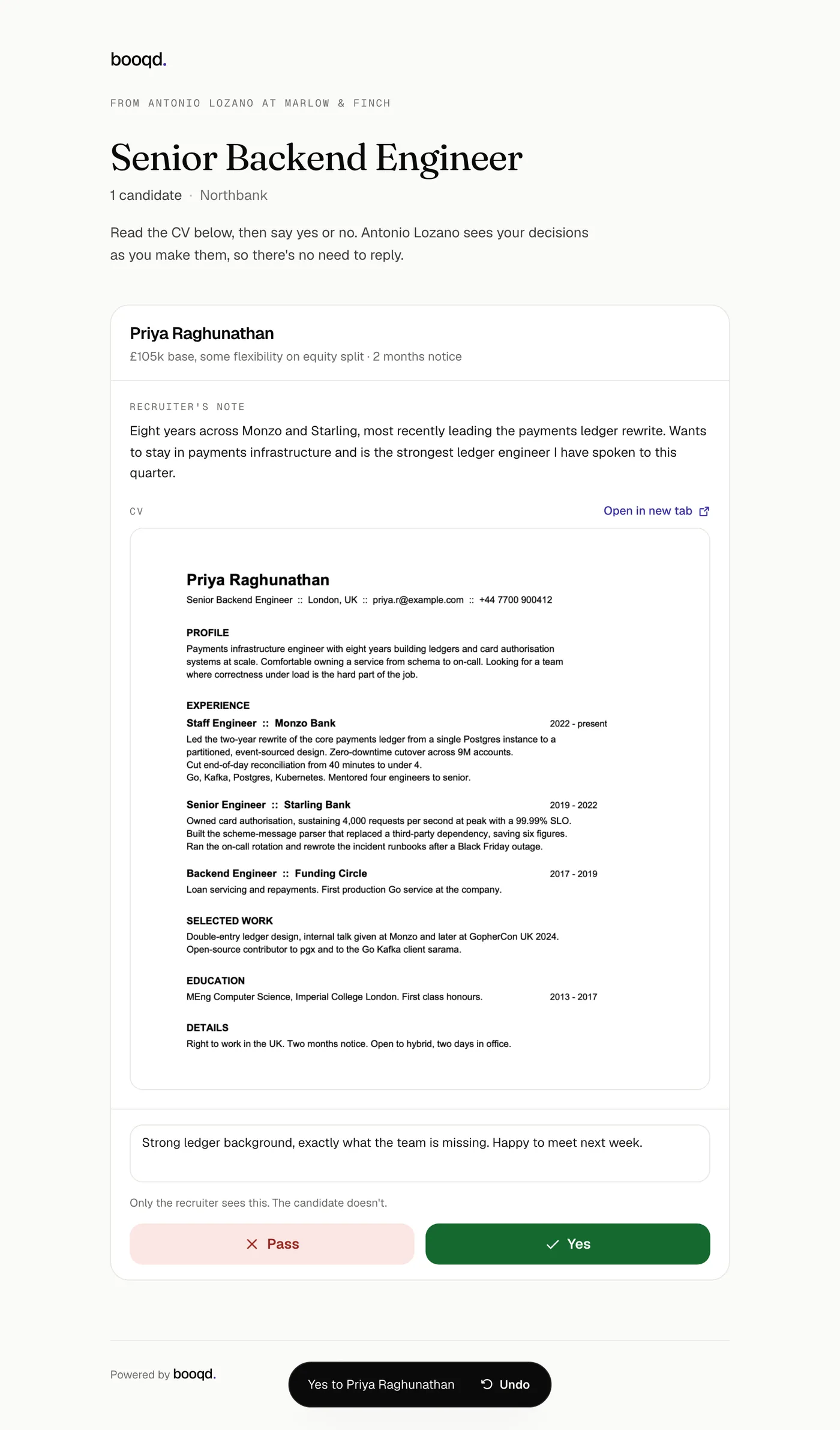
03Decided. No dialog. The decision is already with the recruiter, and it stays recoverable.
Flow two
The recruiter sends
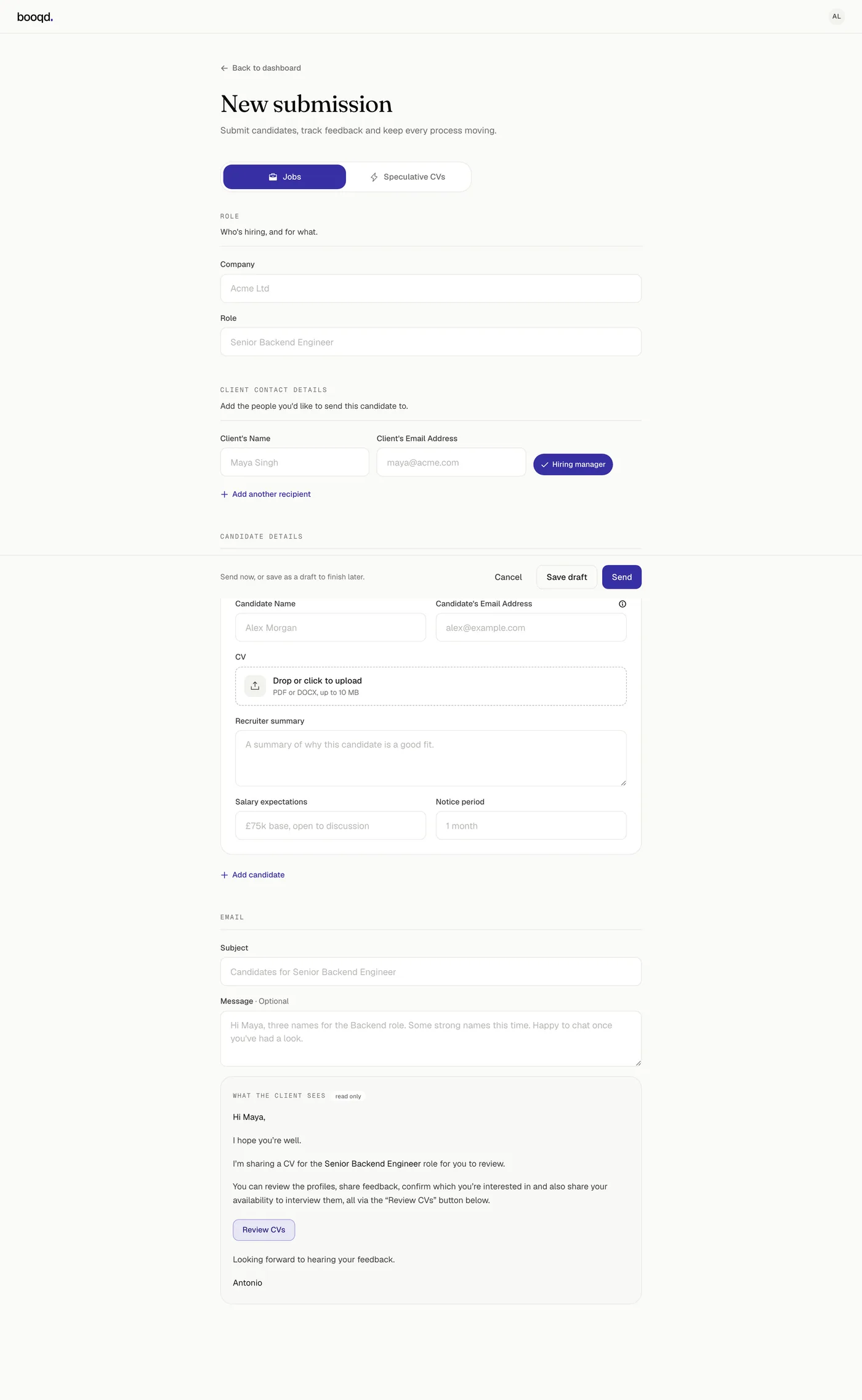
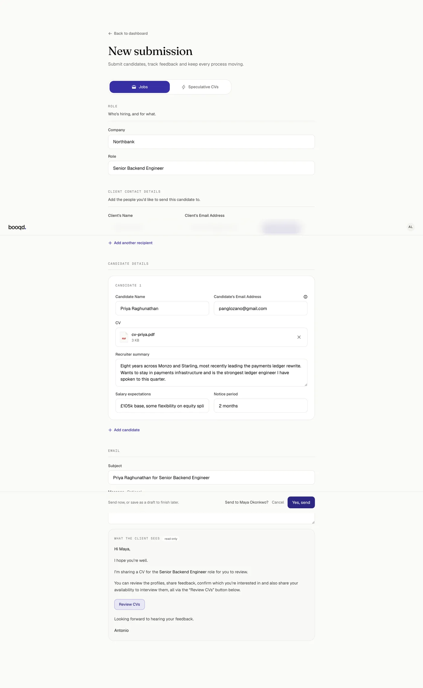
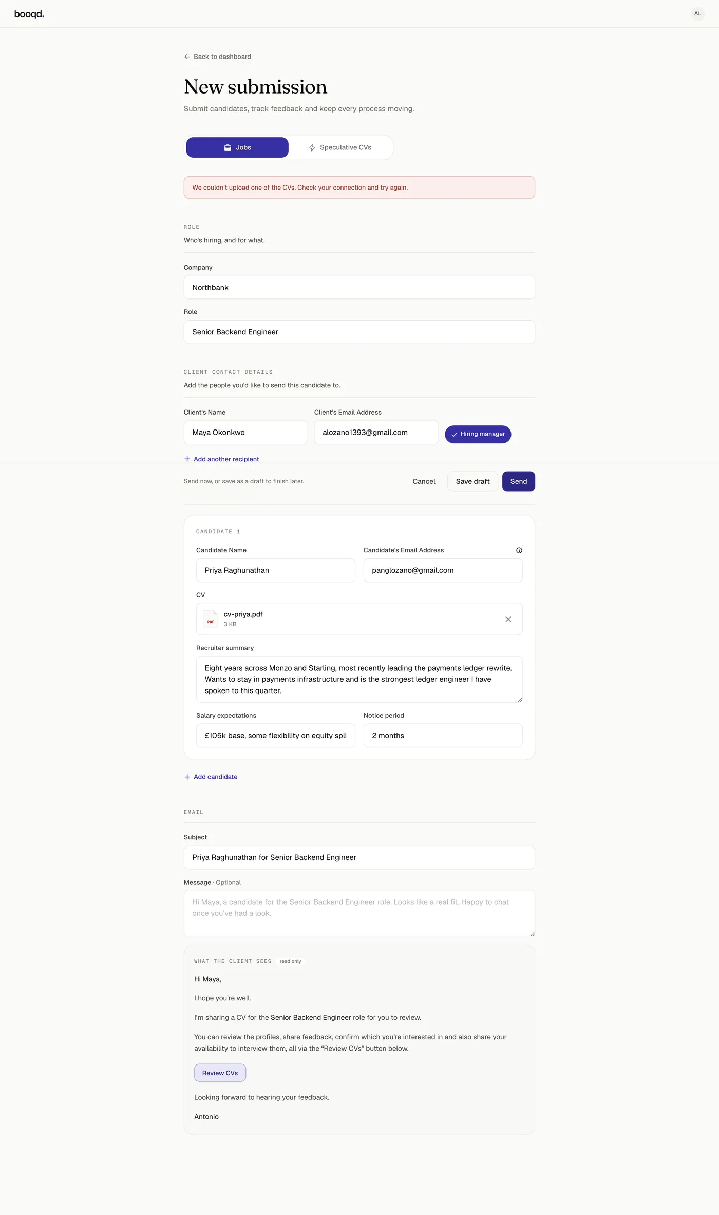
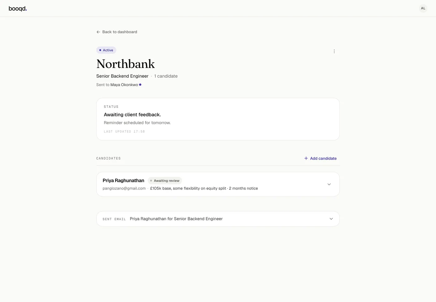
Because the recruiter cannot see the inbox, the compose screen shows the outgoing email in full, read only, underneath the fields that build it. There is no send and hope.
01Role, recipients, candidates, then the exact email the client will get, marked read only.
02IrreversibleThe action bar becomes the confirmation. Sending cannot be undone, so it asks, but it does not open a dialog to do it.
03ValidationCVs upload straight to storage from the browser, so a bad connection can break one. The form keeps everything typed and names what failed.
04Afterwards the status says what happens next. “Awaiting client feedback. Reminder scheduled for tomorrow.” Nobody has to remember to chase.
Flow three
The interview books itself
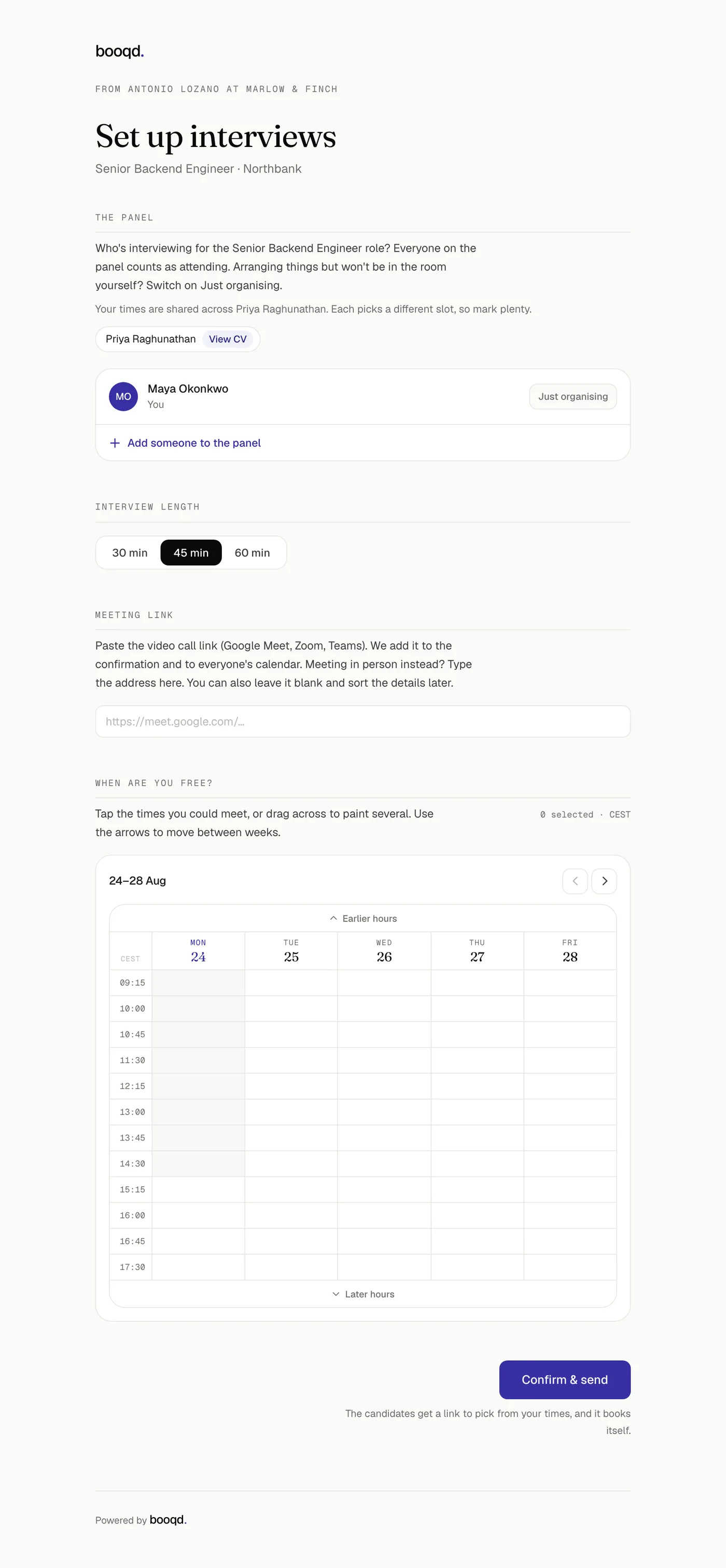
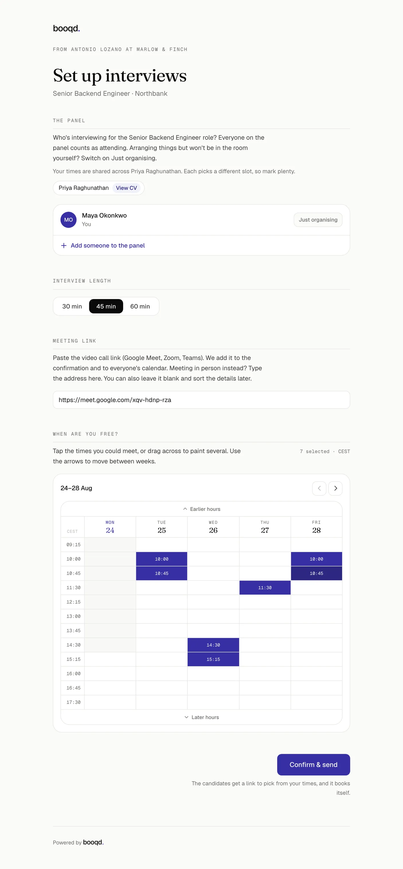
A yes starts the hardest flow in the product, because it needs three parties who are not in the same tool. The hiring manager names the panel and paints times. The candidate picks one. Nobody negotiates by email, and nobody signs in.
01The ask. Who is in the room, how long, where. “Just organising” is there because the person arranging it often is not attending.
02Times are painted on a grid, not typed. The cell is the interview: pick 45 minutes and every cell is 45 minutes long.
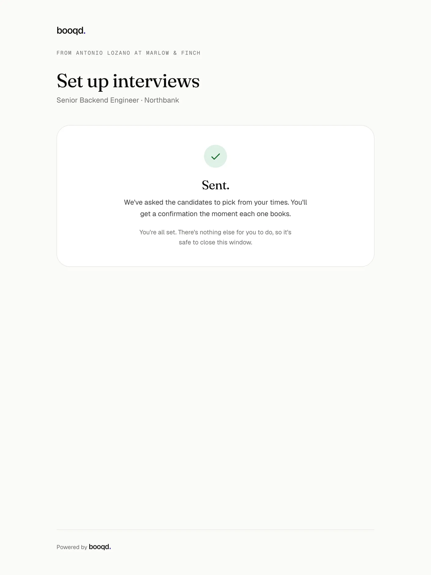
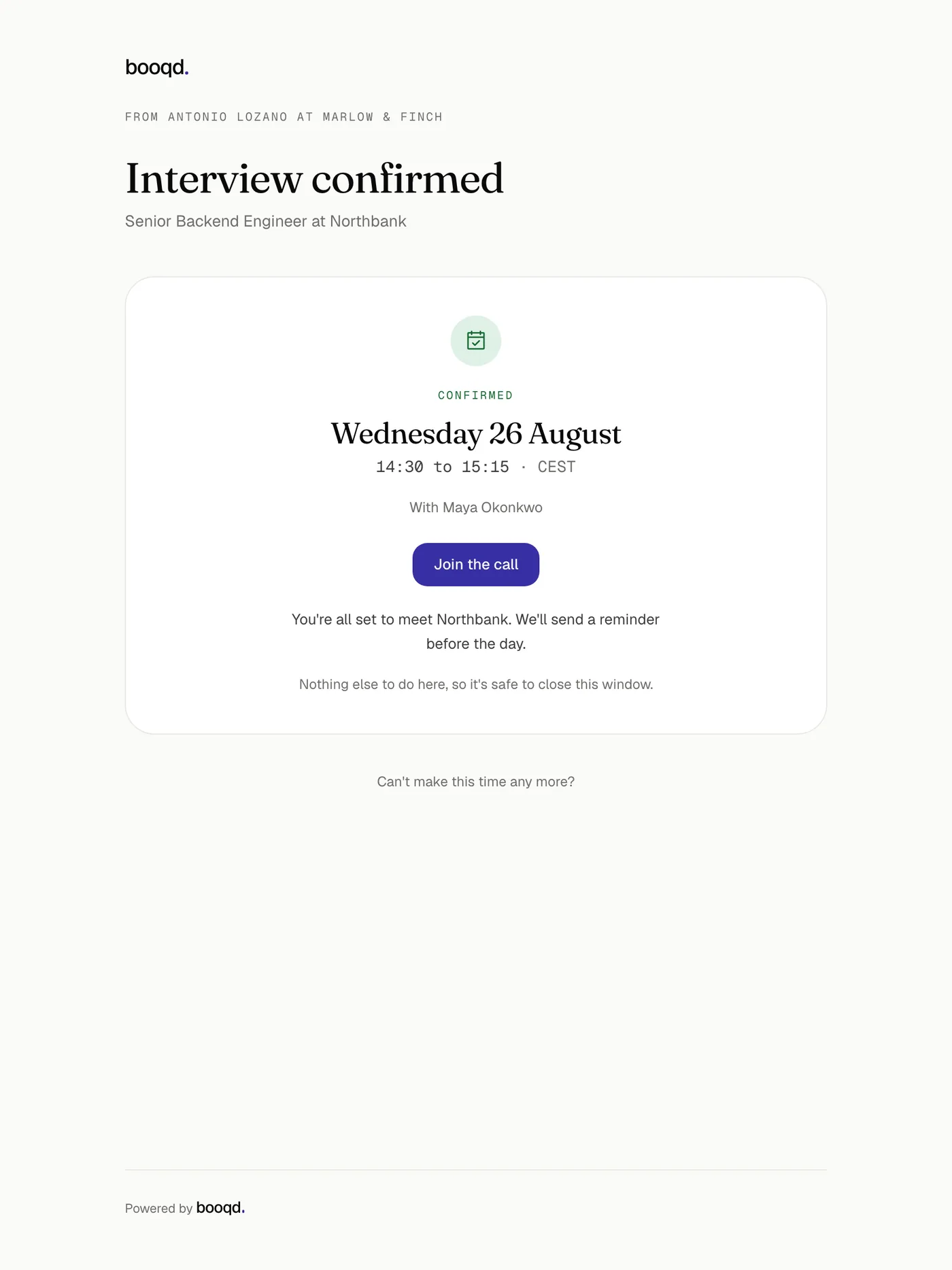
03“Sent. You’re all set. There’s nothing else for you to do, so it’s safe to close this window.” The end of a guest surface says the job is over.
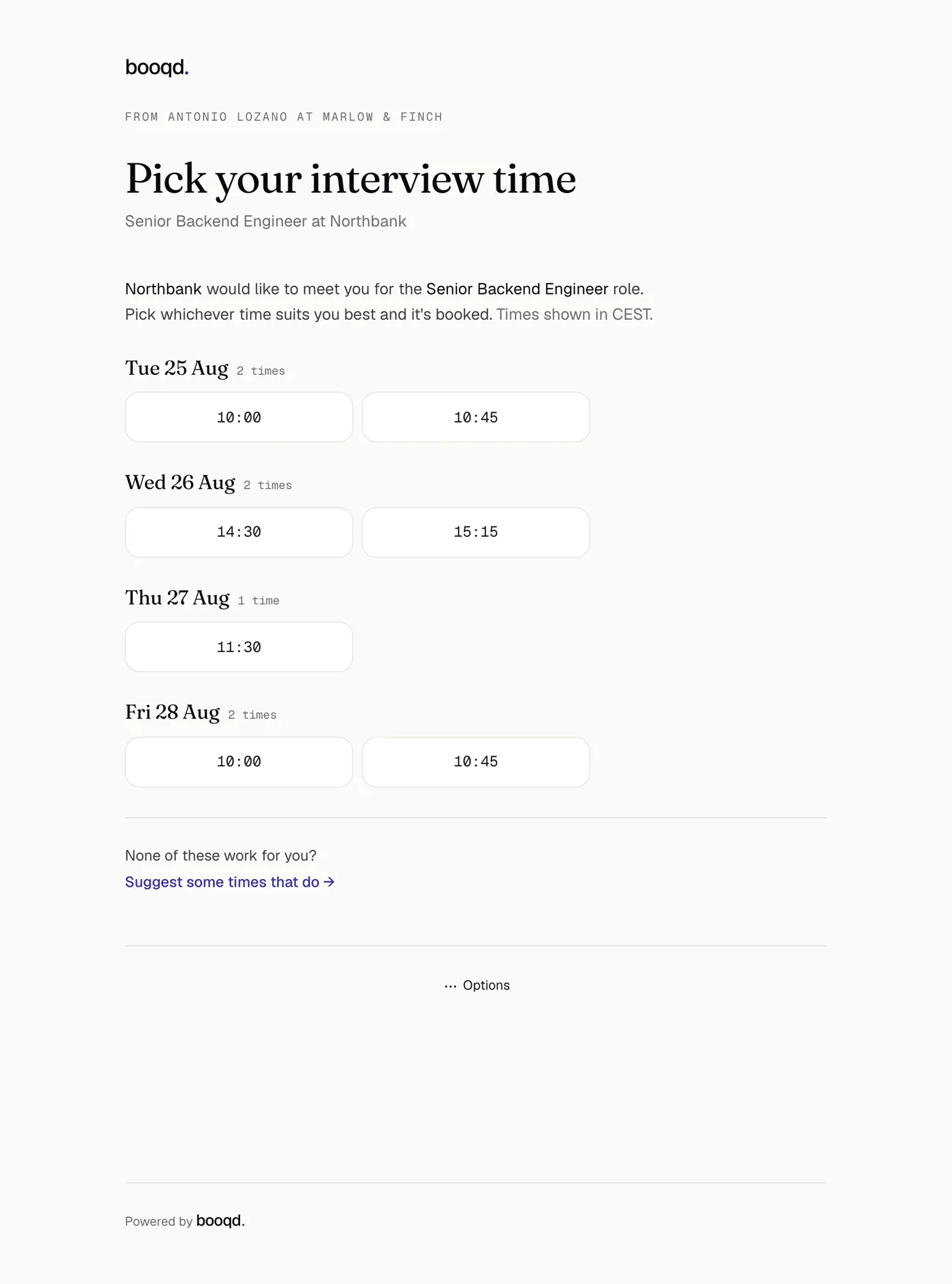
04The candidate gets times, not a calendar. Grouped by day, counted, in their own timezone. One tap confirms in place. None of them work? The same page lets them paint their own instead, and the chase turns round to point at the client.
05Booked, by the candidate, with nobody in the middle. The link to join is on the page and in everyone’s calendar.
The invisible product
Most of it is waiting, so waiting had to be designed
Between every screen above there is a gap where nothing happens because somebody has not replied. That gap is what the product is actually for. It is also the part with no interface, so it needed rules rather than screens.
1
Day one, a first reminder
It goes from the recruiter’s own address and reads like something they would have sent. Nothing about it announces automation.
2
Day three, a second
3
Day five, the last one
Three per action, and no more. The count sits on the action, not on the person, so someone who goes quiet twice about two different things is chased about both.
—
Two days later, a human
Automation stops and the recruiter is told it has stopped. A silent handover is the exact failure this product exists to prevent, so the message that reports it keeps retrying for three days, where a missed chaser gives up after one.
Rule · who hears what
Chase the person who has to act, tell everyone else nothing is needed
Every message in the product is one of five things: a chaser, an update, an action-required, a confirmation or a closure. An update has to say out loud that the reader does not need to do anything, because a recruitment email that does not say so reads as a demand.
Rule · when
Nine to six, Monday to Friday, UK time
A reminder that lands at 3am reads as a robot and one that lands on Sunday is ignored before it is read. Out-of-hours chasers are not dropped, they wait for the next working morning. Interview reminders are the deliberate exception: a 9am Monday interview needs its 24-hour reminder on Sunday.
Rule · never twice
A missed chaser is quiet, a duplicate is the thing we are being blamed for
A send that fails is retried for twenty hours, which stops four hours short of the window where a repeat would still be deduplicated. After that the chaser is abandoned rather than risk the client getting the same email twice.
Rule · never bunched
Twenty hours minimum between two messages in one sequence
Friday six to Monday nine is sixty-three hours, which is longer than the gap between a final chaser and its handover. Without a floor, a client could open Monday to “one last nudge” and, seconds later, “we’ll leave it there for now”.
Edge cases
Fifty-one messages, because every branch needed one
A hire where nobody hesitates needs a handful of them. The rest exist because somebody did something entirely reasonable that a straight line does not cover. I drew each branch first and wrote the message for it second, which is why no branch ends in silence.
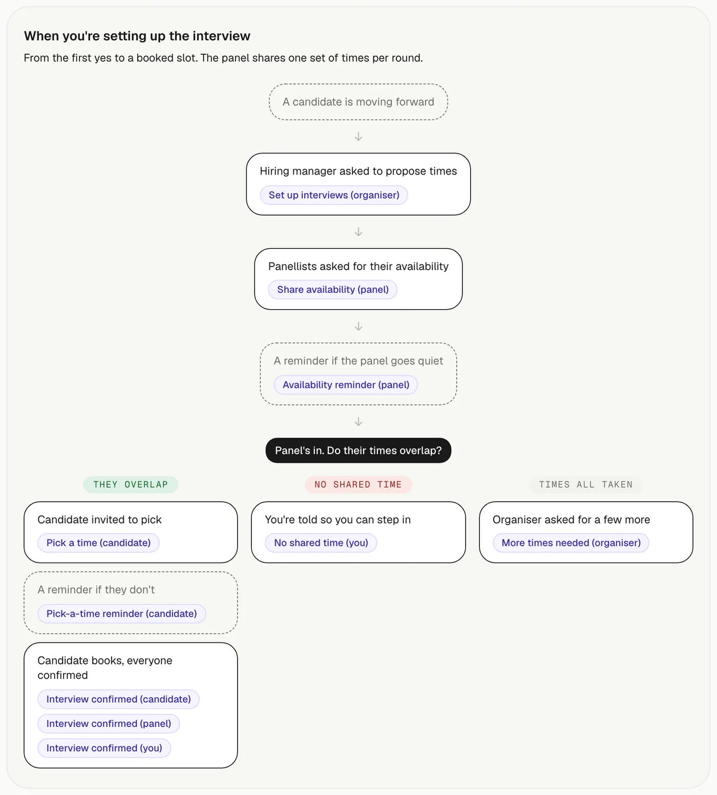
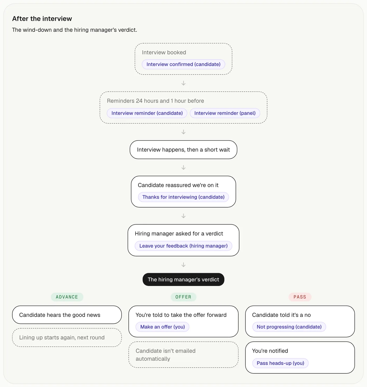
Setting up the interview. Three outcomes, not one. Times overlap and the candidate is invited. Nothing overlaps and the recruiter is told so they can step in. Everything offered is already taken and the organiser is asked for more.After the interview. The candidate is reassured before anyone has decided anything, because the wait after an interview is where a good process still feels like being ghosted.
Edge 01
An interviewer pulls out
booqd does not decide for the client. The message names the three ways forward, go ahead without them, swap someone in, or wait, and it chases the organiser on its own clock. That clock is why it exists separately: riding the panel’s clock meant a pull-out on day four got chased once and one on day six never got chased at all.
Edge 02
A required interviewer goes quiet
Different from pulling out, and it gets a different email. One is a decision the client has made and the other is a silence, and the person who has to act is not the same in each.
Edge 03
Nobody on the panel is free at the same time
The candidate is never shown an empty page. The recruiter is told, with the reason, and the ask goes back to the panel using the link they already have.
Edge 04
The candidate withdraws
Three separate messages, to the recruiter, the client and the panel, because each of them is holding a different half-finished thing. Any booked interview is released rather than quietly left in a calendar.
Edge 05
The client said they would decide by Friday
Chasing before somebody’s own stated deadline is the fastest way to be ignored, so nothing fires until the day after it lapses, and then the count starts again. Being overdue against a promise is a new ask, not a continuation.
Edge 06
The candidate is a speculative pitch, so there is no role
The same compose screen with the role removed, and a reveal step before the interview, rather than a parallel flow that drifts out of step with the first one.
The build
Chosen so one person could ship and then keep it running
Managed services wherever one exists, and types everywhere, because there is nobody else to catch the mistake. The scheduled work is the part that could not be improvised: every reminder is a row with a due time, swept on a cron, never a timer in memory.
InterfaceNext.js App Router, TypeScript, Tailwind
DataPostgreSQL on Neon, through Drizzle
AccountsClerk, with row-level isolation per agency
MailResend, 30 components behind the 51 messages
RemindersInngest, swept every ten minutes against the send window
FilesCloudflare R2, with signed guest links and docx to PDF conversion
RunningVercel
Where it stands
Built, deployed, and early
The product works end to end and is in front of its first recruiter, who is also the person the message spec was written with. It is early enough that I have no adoption numbers worth quoting, and a figure from this base would not survive the second question.
What I would measure first: how long a submission sits before the client decides, and how much of that gap is closed by the reminders rather than by the recruiter chasing manually. That is the only number that would tell me whether the invisible half of this product is doing its job.
What I would change next: the chasers are the same three-step rhythm everywhere, which was the right call for shipping and is almost certainly wrong for a client who always replies on day four.
app.booqd.ai is the product. The sign-in is there, but the account has to be made for you.