The app
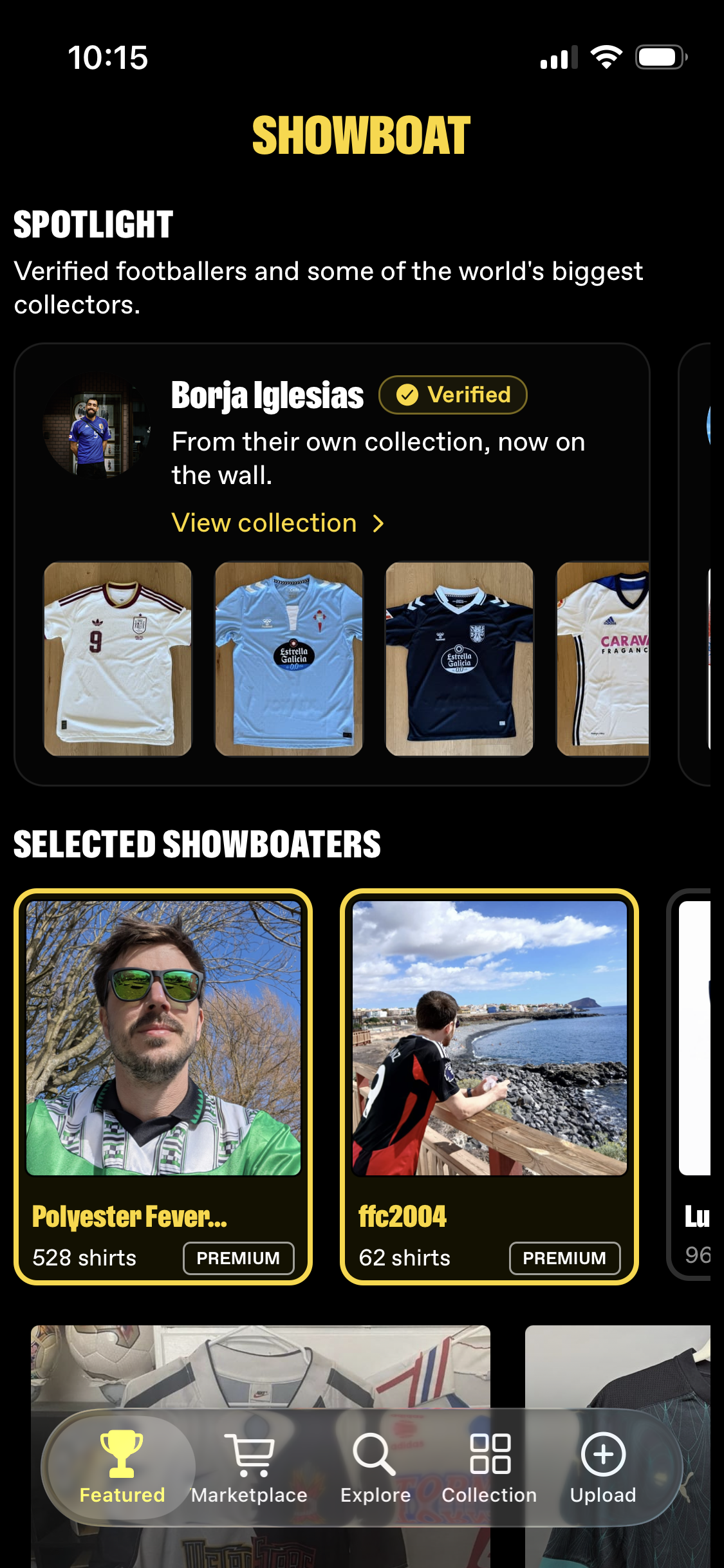
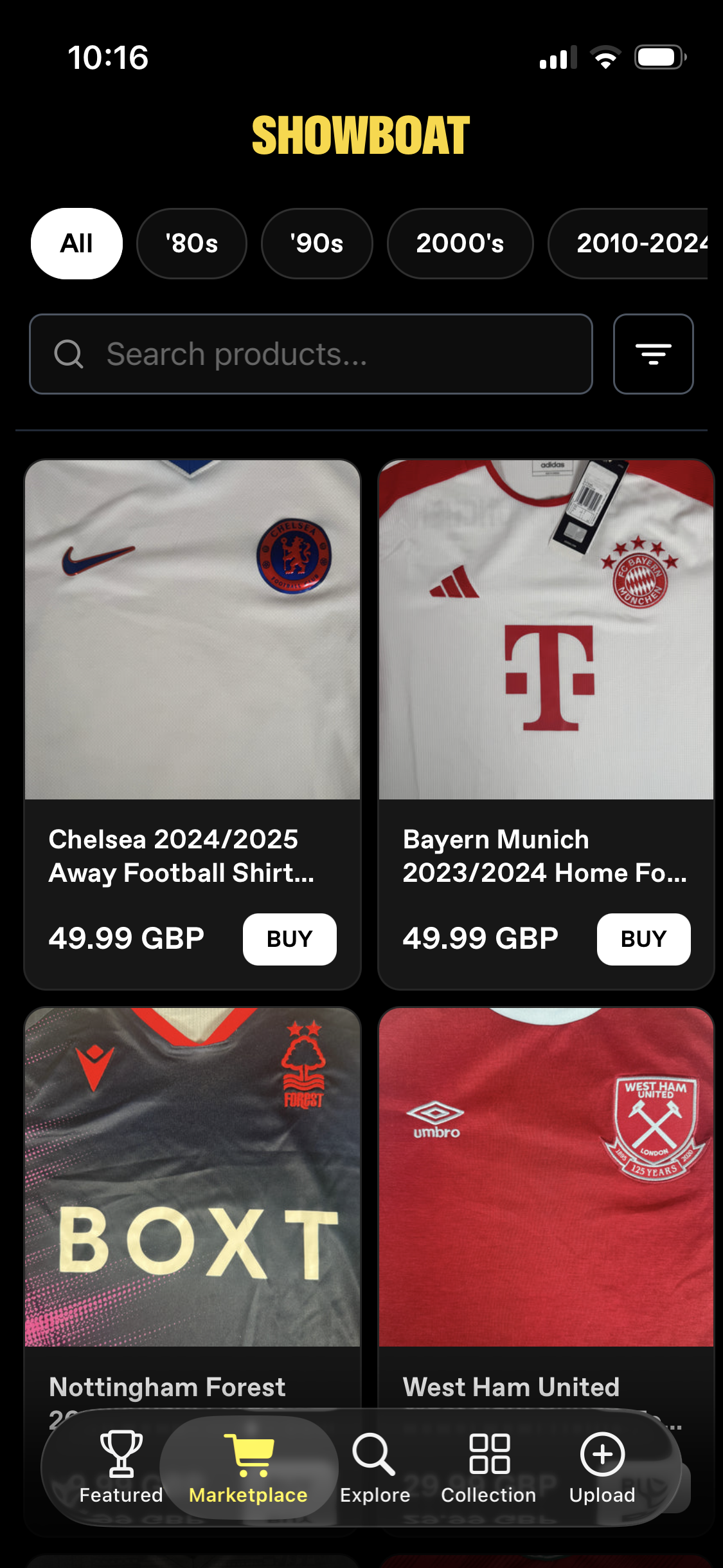
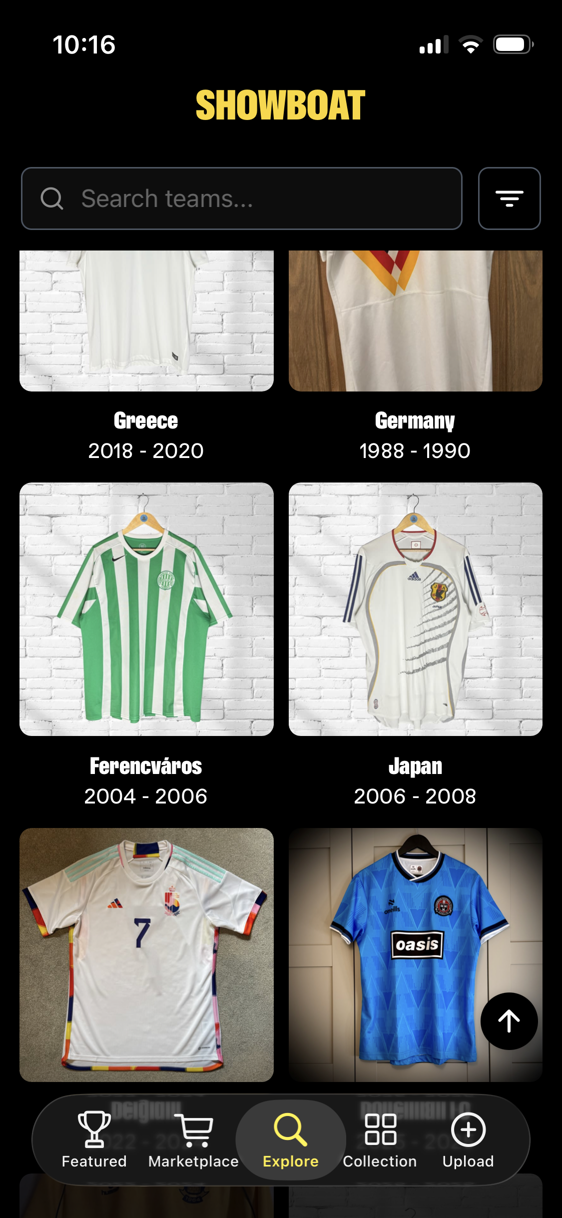
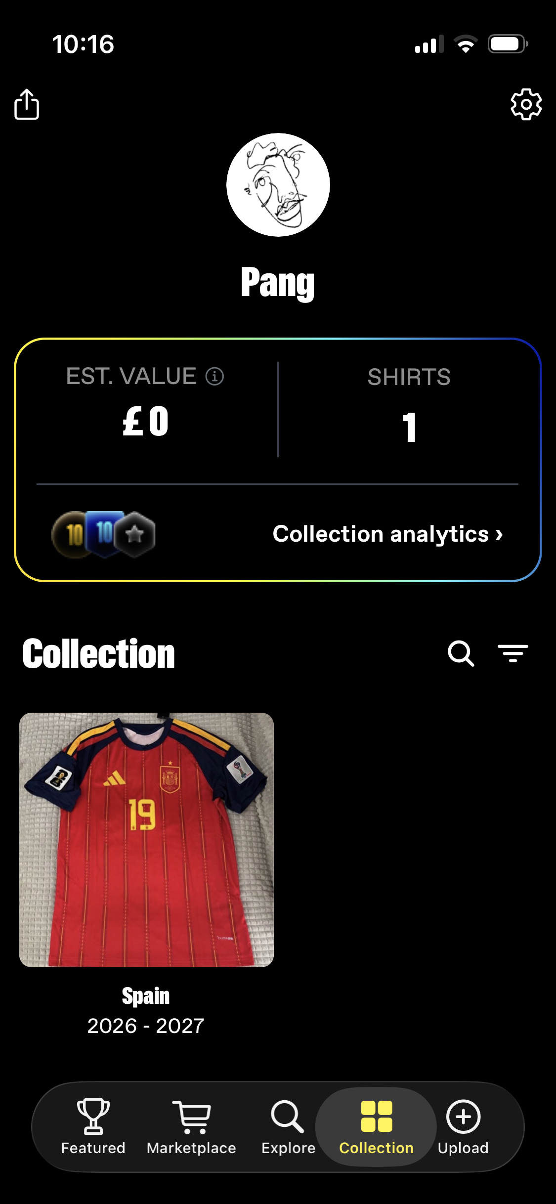
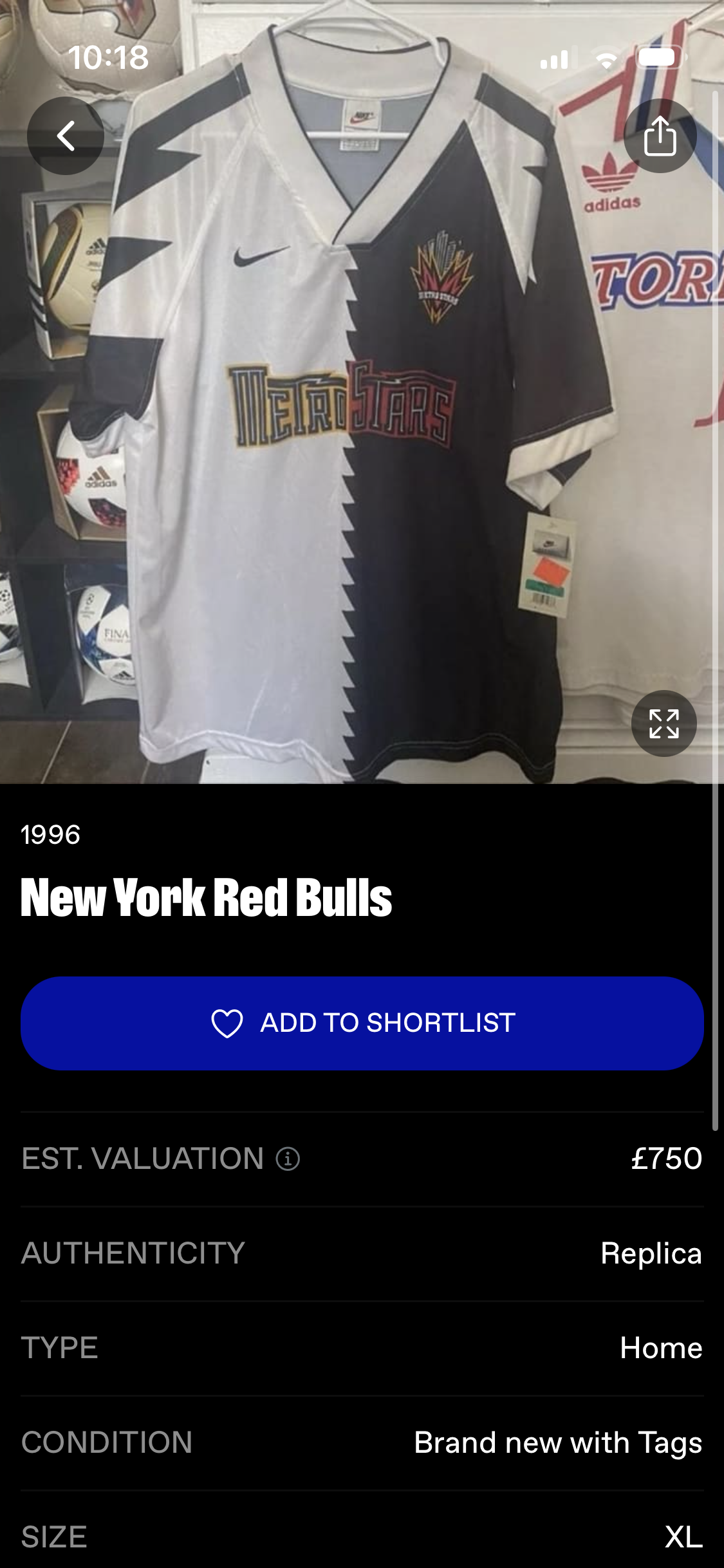
Black canvas, one reserved yellow, and the photographs doing the work. It is good at what it does. You can walk through anyone else’s collection the way you would flick through a rail in a shop.
Showboat / 2026 / iOS
Showboat is a live iOS app for football shirt collectors. You photograph the shirts you own, the app estimates what they are worth, and a subscription unlocks more detail. It works. The question is how many people it can ever work for. I am the external product designer, paid in equity, and the founders bring me the problems they cannot get past.
The app
Black canvas, one reserved yellow, and the photographs doing the work. It is good at what it does. You can walk through anyone else’s collection the way you would flick through a rail in a shop.
The problem
Under 2,000 active users. About four in a hundred pay for premium, which is a healthy rate for a consumer app, and the founders had been treating the low revenue as a conversion problem to fix.
It is not. The app sells one thing, at one moment: the moment you wonder what your collection is worth. You have to already own shirts for that question to exist, so every user arrives with the hobby already in progress. The only lever left is finding more of them.
So I modelled the ceiling: same four percent, same price, more users.
UsersSubscription revenue
The bar is users, the figure on the right is what subscriptions earn. Nothing else in the model moves.
Fifty-five times the users, and it still does not pay a team. Subscriptions were never going to be the business on their own.
Which reframed the design work. The question stopped being how do we convert more of them and became what would make a collector open this every week. A valuation is a thing you check once. Other people’s collections are a thing you come back to.
The profile
Before touching a screen we went through the usage. Almost nobody followed anyone. Almost nobody opened anyone else’s profile. What people did was open their own, upload a shirt, and leave.
For an app whose reason to come back is other people’s collections, that is the finding. The social half was built and unused, so the question was not how to add more of it. It was why the thing you would arrive at is not worth arriving at.
So I started at the profile, which is what you would land on. It opens with a value card and then every shirt you own, newest first, in one uninterrupted grid.
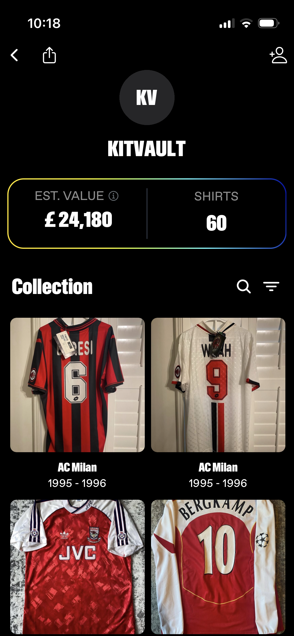
A grid tells you how many. It does not tell you who someone is. Two collectors with sixty shirts each look identical, and the thing a collector actually wants to know is what kind of collector you are.
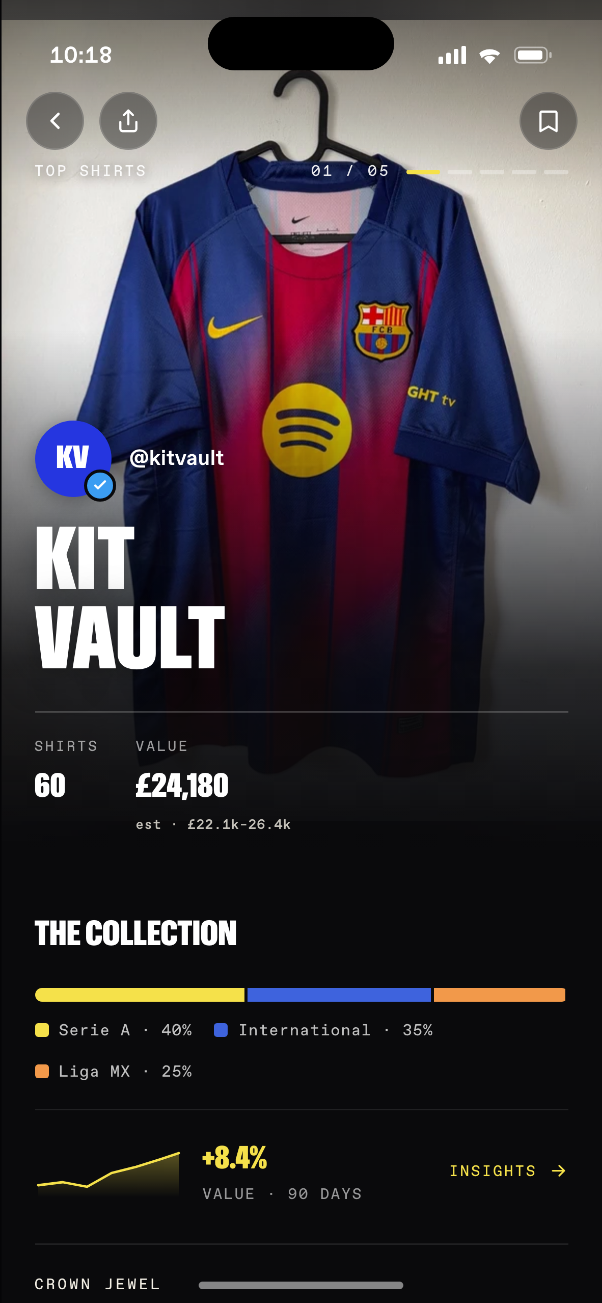
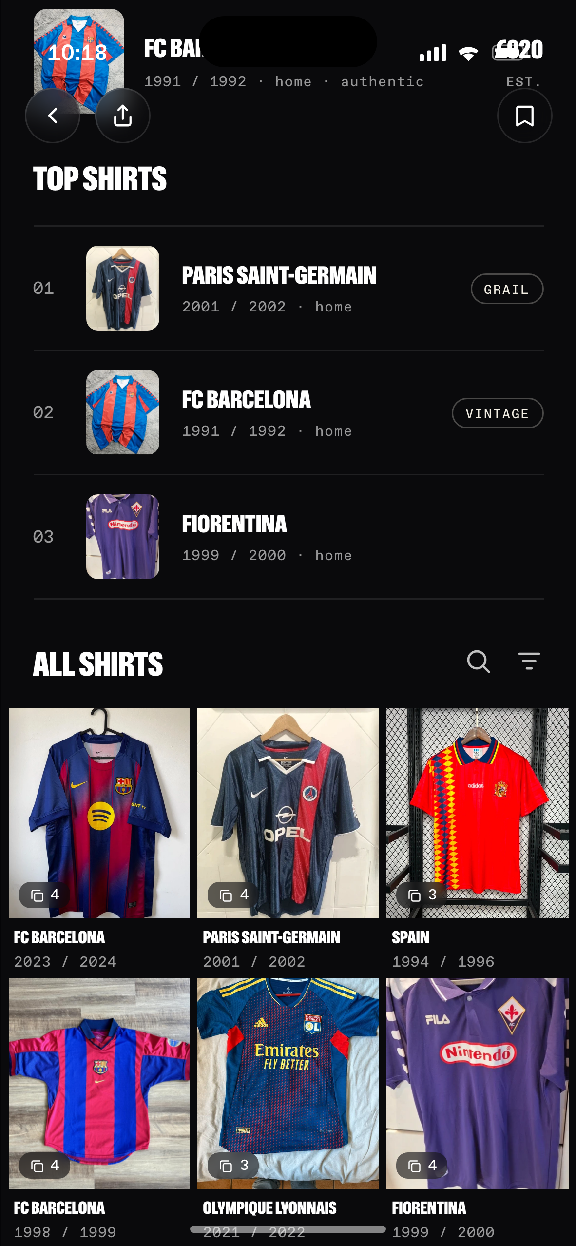
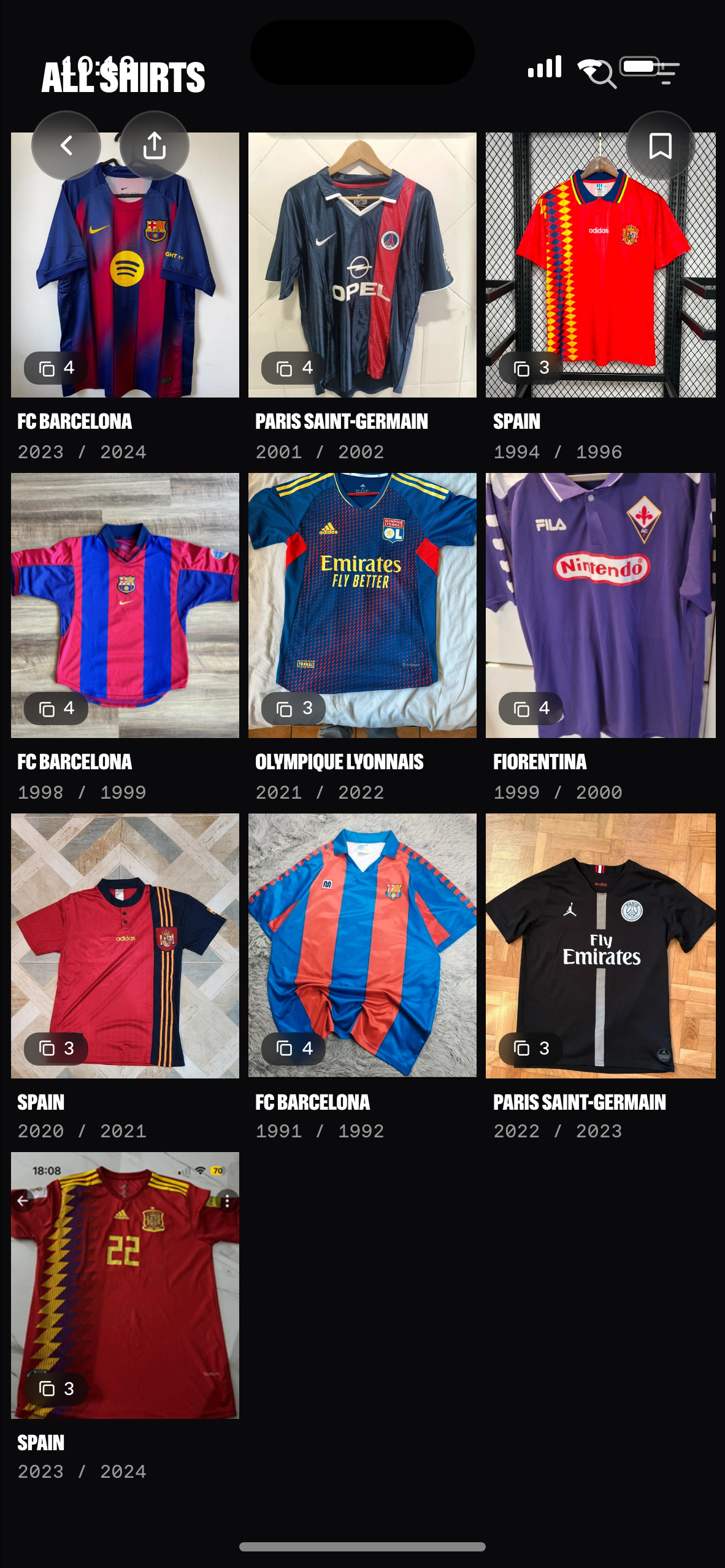
So the profile leads with the collection as a shape, not a count. The hero is the shirt, full bleed, with the name at display size. Under it: what the collection is made of, broken down by league, and the crown jewel called out on its own. Top shirts is a numbered list rather than a grid, with the tags a collector uses out loud, grail and vintage. Only then, everything else.
Neither of those two blocks is invented. The numbered list is the album track list, the pattern the team had already agreed on for the Featured page, moved onto the profile where it describes a person instead of a record. And the breakdown and the trend line are not new either: they are the analytics the app already sells behind Premium, brought out of a locked tab and onto the page other people see. The thing the business charges for is also the thing that makes a profile worth opening, which is the argument the rest of this page runs on.
The reel
Tapping a shirt does not open a detail page. It opens the collection full screen, one shirt at a time, and from there the whole thing is gestures.
The tap is the decision worth defending. Every app that browses photographs fills the frame by default. Filling it here crops the badge and the sponsor off the sides, and those are the two things a collector is looking at. So the shirt sits whole inside the screen, and the space left around it is filled with the same photograph, blurred and darkened, which is why every shirt arrives carrying its own colour. Filling the frame is still there. It is a choice you make, not one the app makes for you.
Sideways is not decoration either. In the app today one photo per shirt is free and four more slots are locked behind Premium, so swiping sideways is the paid feature. This is the screen where paying for it makes sense.
Lists
If the profile is a portrait, the collector has to be able to compose it. Lists is that: group your shirts by club, era or kit type, and the groups become the thing other people browse.
It was also the feature collectors were asking for. Sixty shirts is past the point where you can find anything, and it was the one thing on the table doing two jobs at once: it gives a profile a reason to be visited, and it is something that can carry a price.
One list is free. That is not a new paywall, it is the pattern the app already uses: the first twenty collector notes are free, uploads are capped at two hundred. So the cap needed no new mechanic and no new screen. Creating the second list is what opens the upgrade sheet.
It is also the flow with the most ways to go wrong: naming, multi-select, and a delete that could plausibly take the photographs with it.

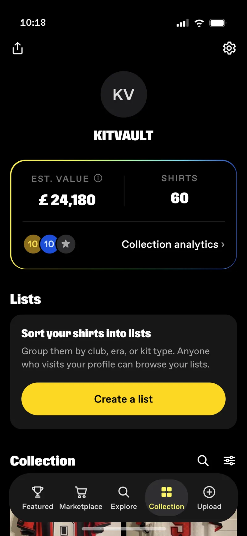
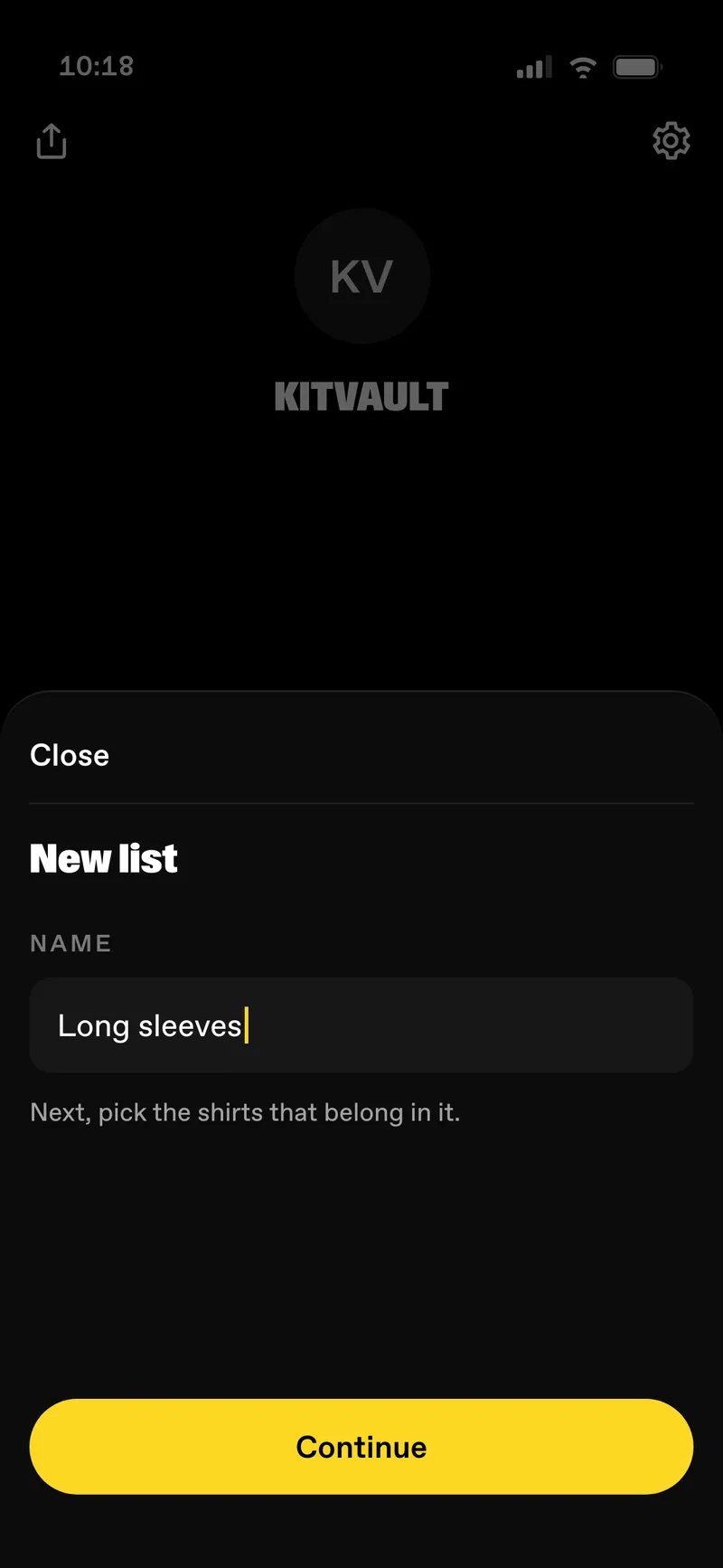
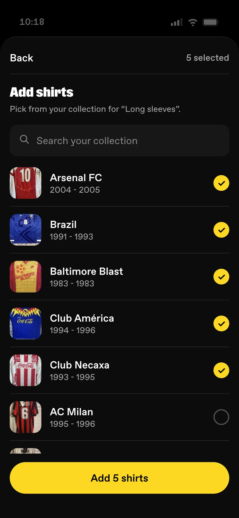
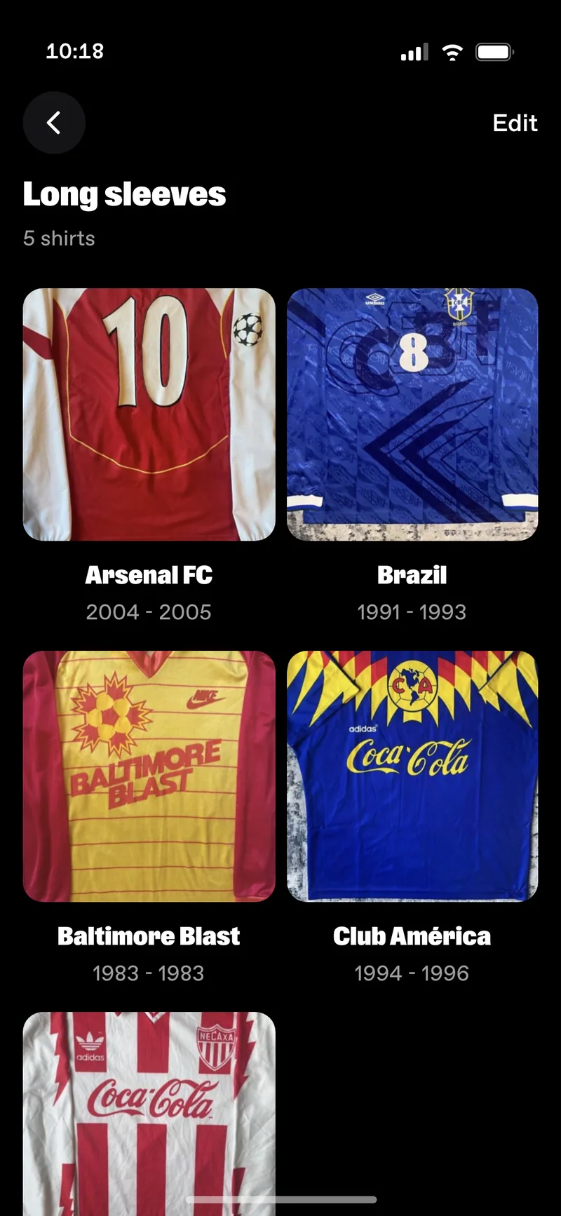
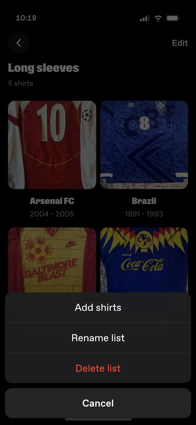
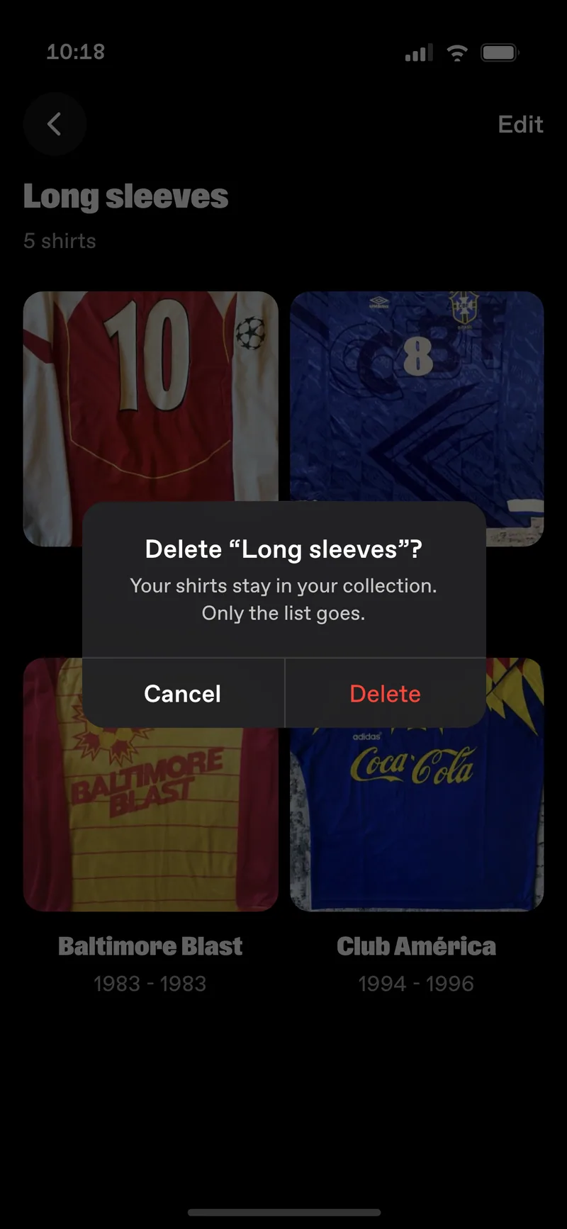
Seven screens, and two of them are the ones nobody puts in a portfolio: the empty state and the delete confirmation. They are also the first two a user meets on a bad day, so they are designed here rather than left to whoever builds the screen.
Which is the point of doing any of it. A list is not a private folder. It is a public shelf: it sits on your profile with a cover, a count and the name you chose, and anyone who opens your profile can walk straight into it.
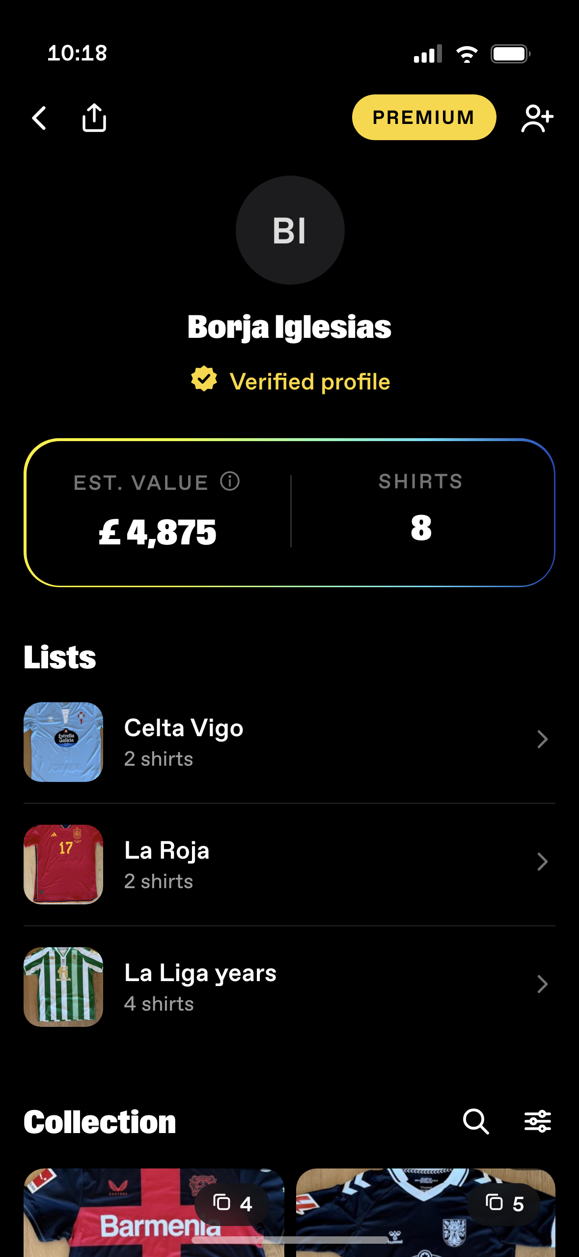
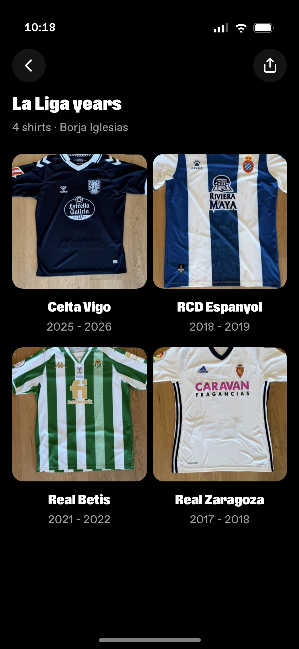
That is the loop the business needed. A valuation answers a question once. A collection you can walk through, arranged by the person who owns it, is something to come back to on a Tuesday. Every list a collector makes is one more room in the app for everyone else.
Premium
Premium is €5.99 a month. Written down, it is a feature list: unlimited lists, deeper analytics, a badge. Seen, it is the same profile with more of it.
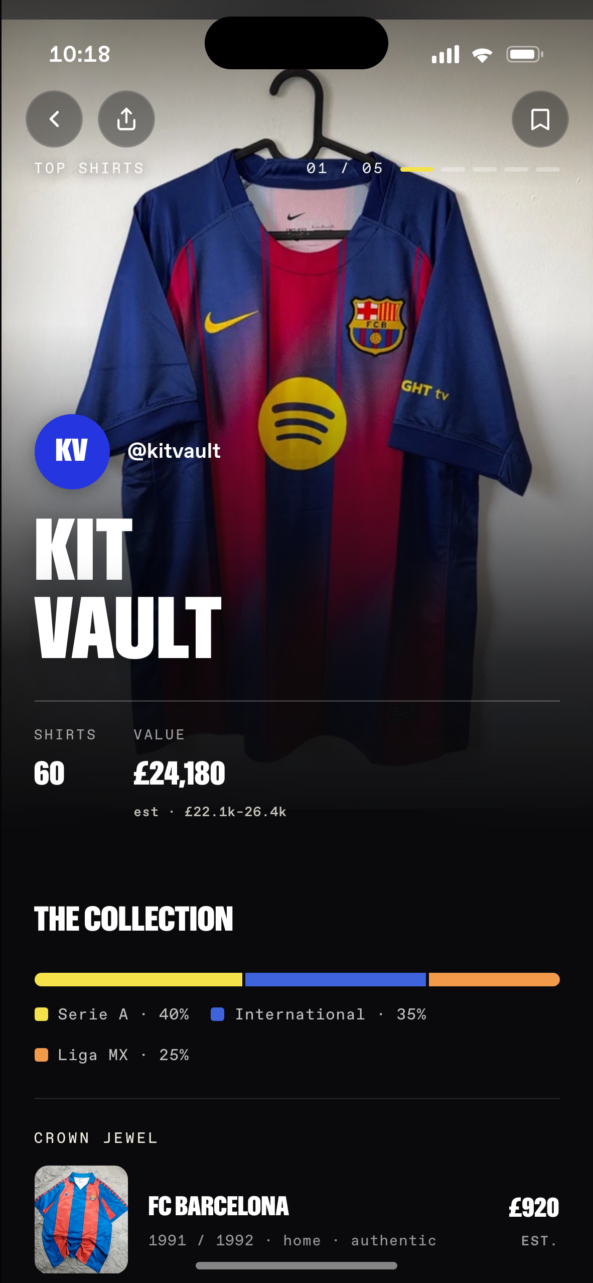
The same collector, the same sixty shirts, the same £24,180. The free profile keeps the hero, the breakdown and the crown jewel, because a collection nobody wants to look at is worth nothing to either of us. What paying adds is the part a collector cannot work out by eye: how the value has moved, and where it moved. Only the right-hand screen carries the trend line, the route into insights, and the check on the avatar.
That decides where the upgrade prompt goes. Not a splash screen, and not a row in settings. It sits directly under the collection value, which is the one place in the app that has already put the question in the user’s head. The hard stop only arrives at the limit.
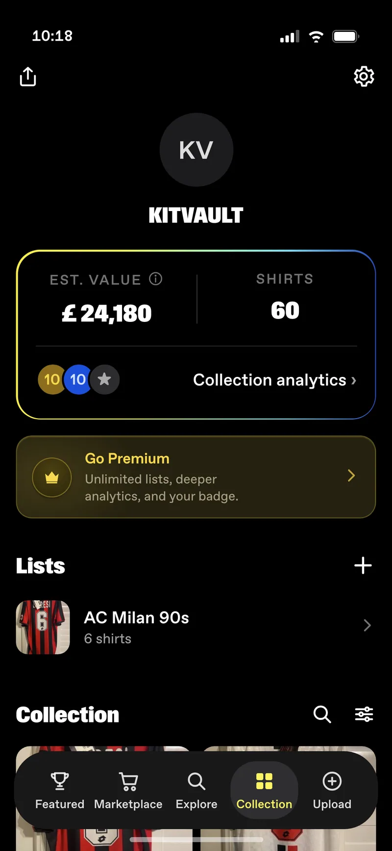
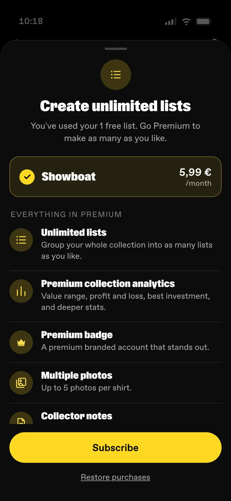
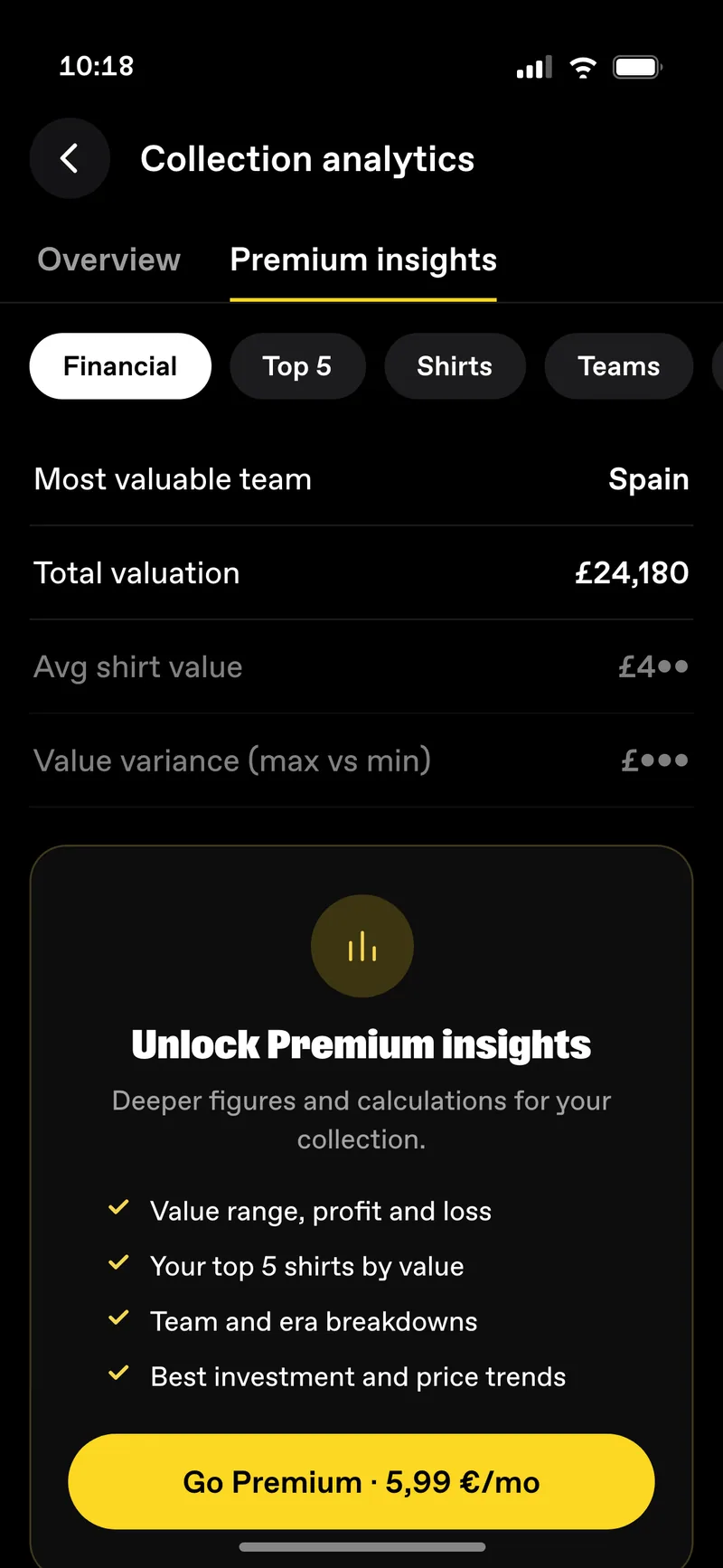
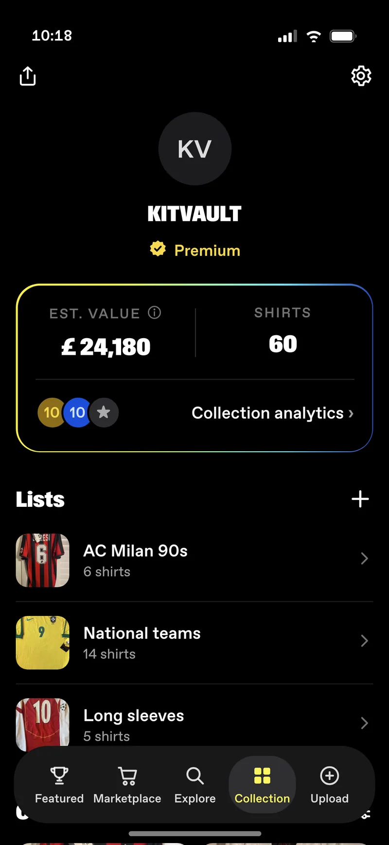
That is the prompt in the right place, and it still converts at four percent. Which is the point of the chart at the top of this page. Four percent is not low because the moment is wrong. It is low because the thing being sold only interests people who already own a collection worth valuing.
The wider question
The profile and the lists make the app worth returning to. They do not change what it sells, and the chart at the top of this page is why that matters.
So alongside the design I built a deck for the founders with four ways forward. Each one is modelled at the same user count so they can be compared, and each is described by what it changes in the product rather than by what it earns. It was presented as a menu, not a recommendation.
ANow
Sharpen what membership unlocks, add annual plans, and move the upgrade prompt to the moment someone opens their collection value instead of a generic splash.
Lowest effort, lowest ceiling. Still selling analytics to people with no intention of spending.
B6 to 12 months
Stop fighting how the app is used. People are here to display and value collections, so sell display and value: prints, certificates, an insurance referral for the largest collections.
Revenue grows with engagement rather than with subscriber count.
CLonger
The buy button already sends people to a shop that has the shirt. Trading is the version where Showboat is part of that transaction instead of pointing at it.
Highest ceiling, and the only path that needs trust infrastructure.
DStrategic
Optimise for the asset rather than the run rate: the catalogue, the valuations, the collector graph.
A different definition of winning, and worth stating out loud so it is a choice.
The honest part
Every path leans on the same unproven thing: that collectors care about their numbers enough to pay for them. We had never checked. So the deck ends with the question rather than a recommendation, and with the cheapest way to answer it: a one-off valuation certificate, priced low, run as a test.
The point of the test is the signal, not the money. If collectors will pay to prove what they own, that is the green light for prints, certificates and insurance. If they will not, path B dies before anyone builds it.
The decision is still open. I would rather show a case where the recommendation has not landed yet than pretend I closed something I did not.
Where it stands
The app was live before I started and it still is. The redesign and the strategy sit with a team of three and one engineer, the monetisation decision has not been made, and Lists was in build when I last checked.
I would rather say that plainly than imply otherwise. The work is the profile, the lists, the loop between them and the argument about where the money comes from. What happens to it next is not mine to claim.